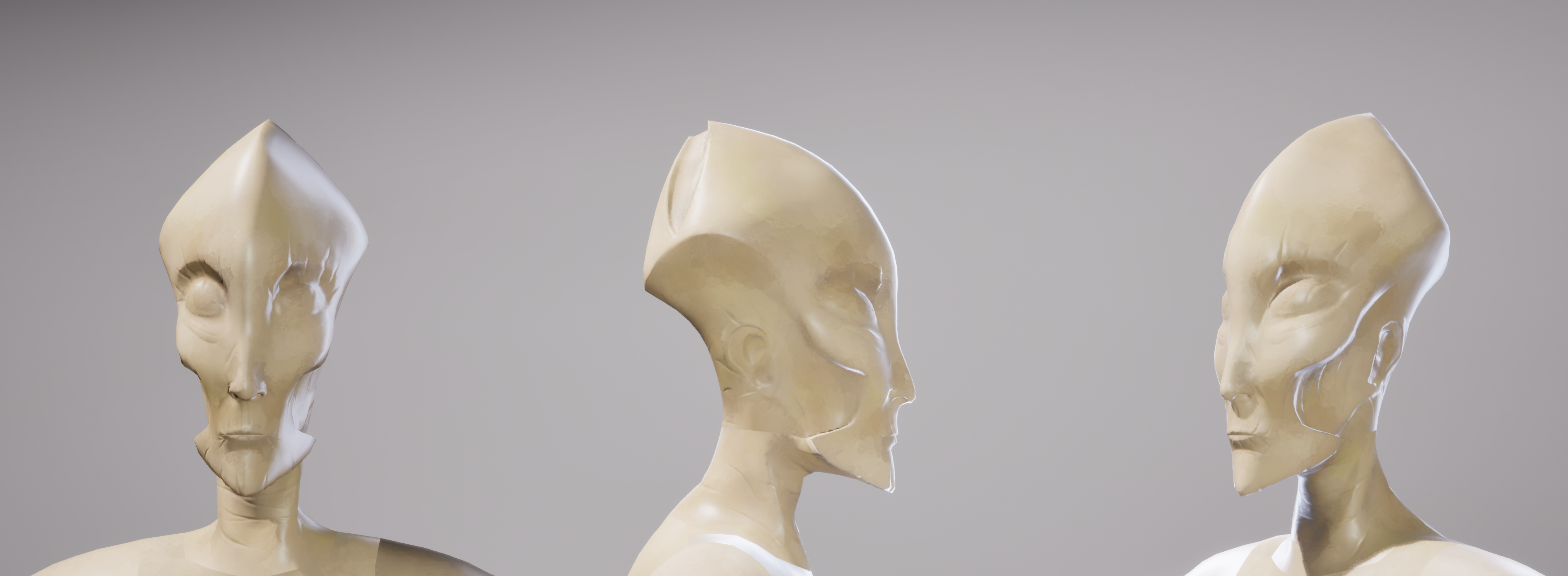
This is the baseline workflow we're going to use to attempt to emulate the texturing style of Hyper Light Breaker. To start, I highly recommend paying close attention to these breakdowns from John DeRiggi, the lead character artist who worked on that game:
You can find his post with the game's visual pillars here. His Artstation account is here, and there are two other artists here and here who worked on that game and have posted their work.
Base Colors
Start in Substance Painter with your game-res model. Make a series of fill layers for your base colors; I only have one in this scene for this demonstration, but you'll need base layers for all the different parts. Establish Roughness and Metallic values as needed. Right-click and add a mask to every base layer except the bottom one, then add a paint layer to that mask and either paint white or black to include or exclude that layer's information from part of the model.
There are a couple of ways to make this easier:
- In the Properties menu for whatever Brush you're using (for masking out base colors I usually use the hard round), there's an Alignment option. Change that to UV and you'll be able to mask in and out based on the 2D UV map.
- Be mindful of what alignment mode your brush is in; Tangent | Wrap, Tangent | Planar, and Camera mode all have their uses:
- Tangent | Wrap orients your brush to align with the model's surface and deforms the brush to conform to the surface
- Tangent | Planar orients your brush to align with the model's surface and does NOT deform the brush and the brush will instead have a falloff if it's too far away from the surface.
- Camera orients the brush to paint according to the camera view
- On the far left side is your toolbar, where you can find the Brush and Eraser tools. The fifth option from the top (which can also be selected by pressing 4 on your keyboard) is the Polygon Fill tool, which uses the model's topology and allows you to fill in entire polygon sections with color or masking information.
- In Substance Painter, select the Brush tool with 1 and the Eraser tool with 2. To increase or decrease the size of the brush, use the bracket keys ([ ]).
Subtle Gradient After applying the base colors, add a subtle gradient from the bottom. This is a common technique to draw the eye toward the important parts of the model. (For a character, this is the upper body toward the head, so I applied this gradient to the legs, feet, and lower torso.) To do this, create a fill layer and make the color a desaturated light purple and set the layer's blending mode to Multiply; this allows the gradient to be uniform across surfaces with multiple colors and makes it easier to change its color. Right-click and apply a black mask, then, with the mask selected, right-click again and apply a paint layer. In that paint layer, paint with white to gently bring the gradient in using a soft brush. (I typically use Smooth Noisy because it has a very low Flow value by default and is pretty straightforward to work with.)
Procedural Brush Strokes
Now we add procedural brush strokes. Create a fill layer and make it a color that's similar to but still clearly distinct from the base color. (This model is meant to be a burnt corpse, so I made mine a dark brownish red, lighter and more saturated than the base—take a look at the references we have of Hyper Light Breaker to get an idea!) Right-click to apply a black mask, and then with the mask selected, right-click and apply a fill layer.
In the Properties menu there should be a button that says grayscale. Go to your Assets window and find the Cells 4 texture (either just search for it or filter for textures). Click and drag that texture onto the grayscale button, and now your layer is masked according to that texture map. (Set the Projection to Tri-planar projection to make it project seamlessly onto the model.) You can see my settings adjusting for scale to get the look we're trying to go for, but every model will be different, so these settings are always subject to adjustment as needed.
These brush strokes, however, can't be the perfect geometric shapes of the Cells 4 texture; they're meant to look more organic. To achieve this quickly and simply, right-click with your mask selected and add a filter layer. Click the filter button and select the Blur Slope filter; this filter is commonly used to quickly achieve a more painterly look. I have it set to the default, but don't be afraid to play around with it.
Duplicate the layers and add different color variations to your model; I added a couple of different, darker shades of brown. In the Cells 4 layer under Properties > Parameters > Seed, I clicked Random to shift around the location of the splotches.
Painted Brush Strokes
This is where we're going to start painting in our highlights and shadows, and this is where baking becomes important; you'll need to have access to the high-resolution version of this mesh. Baking is its own beast and I'm not going to get into it right now, but you do at least need to have baked an ambient occlusion map.
Create a new fill layer with your shadow color using the same purple > multiply method we did for the gradient. This time it's not going to be subtle, so feel free to change around the tone and the exact hue of the color. (A more blueish-purple will give you cooler shadows, and a reddish-purple will give you warmer shadows, so be mindful.) Set the shadow's Roughness value all the way up—you're trying to call attention away from the areas in shadow, so they shouldn't be catching light.
Right click and add a black mask, then with the mask selected, right click and add a generator. Click the button that says generator, then select Ambient Occlusion from the list of options, and it will generate a mask based on the ambient occlusion map you baked in Substance's native baking program. Now ambient occlusion maps are black in places that are in shadow and white in places that are not, but we're trying to emphasize the shadows, so they need to be masked in, not out. With the Ambient Occlusion layer selected, go to Properties > Parameters and change Global Invert to be True.

The ambient occlusion map isn't going to be perfect; there may be unavoidable baking errors simply due to what the model is like, or it's simply not emphasizing every shadow the way you'd like. With the layer mask selected, right click and add a paint layer, then go in and manually touch up where you're seeing errors or add and emphasize shadows where you think they aren't strong enough. This is the part of the process where your artistic eye matters!
(It should be noted that with as simplistic a modeling style as we've chosen, there won't necessarily be the same kind of ambient shadows as the team on Hyper Light Breaker was getting. That doesn't mean there won't be any, just that the vibe is a little different.)
If the shadows aren't intense enough, you can always darken the color. I would also turn symmetry on and use that where you can when you start out on the hand painting; it's less tedious to have ground covered on both sides, but you don't necessarily want it to be perfectly symmetrical all the way around.
Lastly, we're going to paint in highlights, and this is a similar process to the shadows. Make a new fill layer with your preferred highlight color; here I've chosen a color only a bit lighter than my base. Don't lower the roughness too much compared to your base layer, but lower it enough that there's some specular variation; since this is for highlights, we want the light to catch them just enough to draw attention to where we want the eye to go and look interesting. Add a black mask, then add a generator, then click on the generator button and select Curvature from the options.
The curvature map is a grayscale map as opposed to a purely black and white map like the ambient occlusion, but what it does is highlight edges and darken cavities depending on your settings, and that makes your textures more eye-catching and helps emphasize your silhouette. Unfortunately, because it's grayscale it needs a heavier hand to help make it effective as a mask, because the grays will still make that highlight color poke through where it shouldn't. Under Properties > Curvature, you can play around with the settings as I've done here to push back some of that information and leave only the highlight detail. It's still procedural, so it's not perfect, but it helps alleviate the worst. Additionally, lower the opacity of the Curvature generator—Hyper Light Breaker doesn't have particularly strong edge highlights, instead relying on rim lights, but we do need to have a foundation to work with as we add in the painted detail.

Lastly, we'll need to paint in highlighted areas and mask out areas that shouldn't be lit. Like with the gradient, this is about leading the eye to places of interest; on a character, this is typically the head and the hands, and on this character in particular we also want to highlight the horn-like growths from its body. Use a soft, low opacity brush to do this so as not to overpower the paint strokes.
That should be the information everyone needs to at least get started on textures!